-
AllZoneAdmin
- May 27, 2024
How to Use UI/UX Design Principles to Create Engaging Applications?
In the current digital era, UI/UX design principles make applications more engaging. You must understand the fundamentals of UI/UX design to accomplish this. These principles help you develop highly functional and aesthetically pleasing user interfaces and experiences
For a small business or startup, gaining new customers is always expensive. It is difficult to create loyal customers if you have a clumsy user interface. This is the reason why app developers focus more on the user experience. According to Zendeck research, up to 61% of consumers will go elsewhere to do business after just one negative experience. Conversely, if they find something valuable, they will remain.
Craft an app users love. Get a free UI/UX design consultation today.
It takes more than just a great idea to stand out in the crowded app market of today. Your application must be fun, easy to use, and engaging to draw users in genuinely. UI/UX design is useful in this situation.
In this blog, we will examine the fundamentals of UI/UX design and how to apply them to develop user-engaging and engaging applications.
Overview of UI/UX Design
User interface and user experience designs are referred to as UI/UX designs. UI design is the interface through which users interact with the product. For instance, text, images, sliders, buttons, widgets, and other interactive elements can be part of this. On the other hand, UX design refers to the development of the user experience while interacting with the product or service.
To put it briefly, UI (User Interface) design is concerned with a product’s appearance and organization. However, the focus of UX (user experience) design is on how users engage with and utilize the product.
What are some of the basic UI/UX design principles?

Understanding fundamental UI/UX design principles in-depth is necessary to create an engaging application. These guidelines guarantee that your application is both aesthetically pleasing and functional, as well as user-friendly.
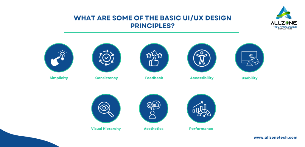
Key UI/UX Design Principles
- Simplicity: Make interfaces simple to use and clutter-free.
- Consistency: Make sure that all of the application’s design components are consistent.
- Feedback: Answer user actions in a clear and timely manner.
- Accessibility: Create with all users in mind, including those with impairments.
- Usability: Provide an intuitive and user-friendly application.
- Visual Hierarchy: Prioritize important elements when directing users’ attention.
- Aesthetics: Develop aesthetically beautiful designs that improve user satisfaction.
- Performance: Ensure that all interactions are fluid and load quickly.
How to Implement UI/UX Design Principles
1. Simplicity
Making applications that are engaging requires simplicity. It is one of the key elements of UI/UX design principles. A straightforward interface is simple to use and comprehend. Adopt a minimalistic style for your design. Eliminate anything superfluous that does not advance the user’s objectives. Give clear instructions for navigation. Use familiar icons and terms. Make good use of whitespace to cut down on distractions and draw attention to important details.
As an example, think about the Google home page. With its clear navigation and uncluttered design, it is a shining example of simplicity. Google makes sure that people can concentrate on their main task, which is searching, by reducing distractions.
2. Consistency
Users can learn and anticipate how to use an application with the help of consistency. Establish a design system with elements, colors, and fonts that are all consistent. Utilize common elements, such as menus and buttons, consistently throughout the application. Make sure comparable interactions result in comparable results.
For instance, it is well known that Apple’s ecosystem is reliable. The design elements are the same whether you are using an iPad, iPhone, or Mac. This is why switching between devices is a seamless experience.
3. Feedback
User feedback enables application owners to conclude the effects of their actions. To indicate actions, use visual signals such as color changes or animations. Also, give loading indicators so users can see that the application is working. Provide solutions along with clarified error messages.
As an example, Dropbox ensures that users are aware of the status of their uploads. They provide instant visual feedback and progress indicators when they upload a file.
4. Accessibility
Ensuring accessibility in application design guarantees that all users can engage with it. Verify that a keyboard can be used to navigate the application. Moreover, provide appropriate HTML tagging and ARIA labels to assist screen readers. To improve readability, use high contrast between the background and text colors.
Many accessibility features, such as high contrast modes and screen reader support, are available in Microsoft Office products. This enables users with a variety of disabilities to use the software.
5. Usability
Usability is one of the most important UI/UX design principles. Making an application easy to use is what usability is all about. To find usability problems, test your product with real users. Also, facilitate a seamless onboarding experience for users. For difficult tasks, provide tooltips and clear instructions.
For example, Slack provides an excellent onboarding experience. They provide a thorough onboarding guide that explains how to use the platform effectively.
6. Visual Hierarchy
A visual hierarchy directs users to the most crucial information first. To draw attention to important components, use font weight and size. Also, put crucial components in eye-catching locations, such as the top or middle of the screen. To highlight important areas, use contrast and color.
Newspapers make good use of visual hierarchy by using bold and large fonts. They use large, weighted fonts for headlines and smaller fonts for less important content. By doing this, the reader can navigate the content easily.
7. Aesthetics
Designs that are visually appealing increase user engagement and satisfaction. Select a unified color scheme that is representative of your company. Moreover, use readable and eye-catching typefaces. To improve the design, add eye-catching graphics and photos.
As an example, Instagram creates an engaging user experience. It combines a visually appealing and cohesive color palette with high-quality images and easily navigable fonts.
8. Performance
Performance has a big influence on the user experience. To speed up load times, write clear, well-optimized code. Use caching techniques to increase performance. UI/UX design principles ensure the app works well and is responsive across all platforms.
For example, Amazon’s website has optimized performance. This leads to responsive design and fast load times. As a result, it is easy to shop on desktop and mobile devices.
Best Practices for UI/UX Design

Keep users in mind:
Always keep the user in mind when designing an application. Recognize their wants, habits, and areas of discomfort. Consider yourself as the users would. To help with design decisions, create comprehensive user types. Map out user journeys to determine important interactions and touchpoints
Focus on Content:
Content is an important part of UI/UX design. 94% of people believe that a brand’s reputation is reflected on its website, and that a brand’s appearance is what defines it. Ensure the content is clear, concise, and relevant. Use readable fonts and pay attention to the proper spacing. Respect the tone of voice of your brand and audience. Moreover, arrange the data logically to enhance understanding.
Test and iterate:
Iterating and testing your design are essential elements of app development. It helps you learn more about how users interact and do usability testing. To compare various design elements and determine the best options, conduct A/B testing. Moreover, create feedback loops to collect user input on an ongoing basis.
Common UI/UX Design Mistakes to Avoid

UI/UX design principles provide a great overview of how to create an innovative application. However, there are some common mistakes that we should avoid making while developing the user experience and user interface. The general user experience can be enhanced by avoiding the following common errors.
- Avoid overstuffing users with features by concentrating on those that are truly necessary.
- In order to make wise design decisions, take user feedback into account at all times.
- Verify that every interaction and component of the design is consistent.
- Ensure that the application is as fast and efficient as possible.
- Make sure the navigation is clear and simple to use.
Conclusion
To create engaging applications, one must grasp UI/UX design principles. You can design apps that delight users and entice them to return by emphasizing simplicity, consistency, feedback, accessibility, usability, visual hierarchy, aesthetics, and performance. To make your application better, never forget to conduct ongoing research, design, testing, and iteration. Make sure the user experience is successful by avoiding common pitfalls, utilizing best practices and using appropriate tools.
Put these principles into practice right now and boost engagement. Transform your app with AllZone Technologies’ expert UI/UX designs.
FAQs Section
1. What Is The Difference Between UI And UX Design?
The visual elements of an application, such as buttons, icons, and colors, are the focus of UI (User Interface) design. User experience design, or UX design, places an emphasis on the whole user experience and satisfaction, taking into account factors like usability, accessibility, and overall flow.
2. Why Is Simplicity Important In Ui/Ux Design?
Users find it easier to navigate and finish tasks when things are simple because it lowers cognitive load. By offering a clear and concise interface, it increases usability, lowers errors, and boosts overall user satisfaction.
3. How Can I Ensure My Application Is Accessible To All Users?
Maintaining high color contrast, employing appropriate HTML semantics and ARIA roles for screen readers, allowing keyboard navigation, and offering text alternatives for non-text content are all ways to ensure accessibility. Test your application frequently using real people with disabilities and accessibility tools.
4. What Tools Can I Use for Wireframing and Prototyping?
For wireframing and prototyping, popular programs include Sketch, Axure RP, Adobe XD, Figma, and InVision. With the aid of these tools, user testing and collaboration are made easier by the creation of interactive prototypes and thorough wireframes.
5. How Can I Test The Usability Of My Application?
Real users can be used to test usability, and A/B testing, survey and interview feedback, user behavior analysis with analytics tools, and user feedback gathering are other methods. Make continual improvements to your application by using these insights to iterate.

